Cutting Context on Campus
The Letter ‘C’
The letter ‘c’ is constantly around us. It’s the 13th most frequently used letter and one of the first that children learn to read. The use of the letter ‘c’ in English is fascinating and deserves much more attention than I could give it here, so we’re going to completely disregard it and try something entirely different.
Dismantling Meaning
Imagine for a moment that you are a toddler. The world around you is still new and you cannot read. In that time before learning to read, or learning the alphabet in general, the letters still exist, just without any imposed meaning.
I would like to invite you to exist in this time, where we set aside all of what we know of reading, and all of the history of the third letter of our alphabet, and just appreciate the art and aesthetics of it as we journey around Fleming College.

Installments
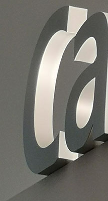
This illuminated free-standing installment is my favourite across all of campus. It’s almost ethereal with its sweeping curve and slight shine. It also has a slight imperfection where the bottom of the curve is flattened to provide a base to sit upon, making it all the more visually interesting.

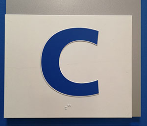
This blue ‘c’ is much more geometric, but equally striking. Perhaps if we take a closer look we can make more of it than just a letter. Perhaps it’s a horseshoe above a blacksmith’s shop, a bend in a great river, or an eel idly swimming by
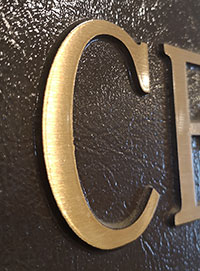
This brass ‘c’ is timeless and bright. I love the way it glows in the sunlight and the slight serif at the terminal of the curve. Set against its textured backdrop it appears bold and wise.

Texture
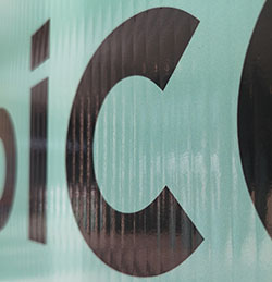
Our last two ‘c’s are both impermanent features comprised of beautiful textures. To the left, we have a ‘c’ sitting amongst the folds of a cloth bag, while on the right we have a distorted ‘c’ printed on a deeply creased board.

I love how the slight fold in the cloth brings the letter away from strict typography and gives it a slight wave near the base, while the fabric itself creates this bold texture that slightly distorts the ink at the fabric.

The poster board ‘c’ stays much truer to its intended form, the texture is just as striking. When you look at this image you can almost feel the poster board, while the reflection of light brings to mind a viscous liquid.
Ignoring the Signs
Next time you are around campus I hope this inspires you to do your absolute hardest not to read the signs around you. Take them in and appreciate the aesthetics. Use your imagination and imply new meaning. And if because of this you get lost, I guess you’ve stumbled upon an adventure.